NXT Lacrosse is one of the leading youth lacrosse club and event operators in the country.
They run both boys and girls field clubs, events, and Box lacrosse events.
They run both boys and girls field clubs, events, and Box lacrosse events.
Overview
As the UI & UX designer, my role was to take the sitemap and setup wireframes. After, I created high fidelity designs with those wireframes.
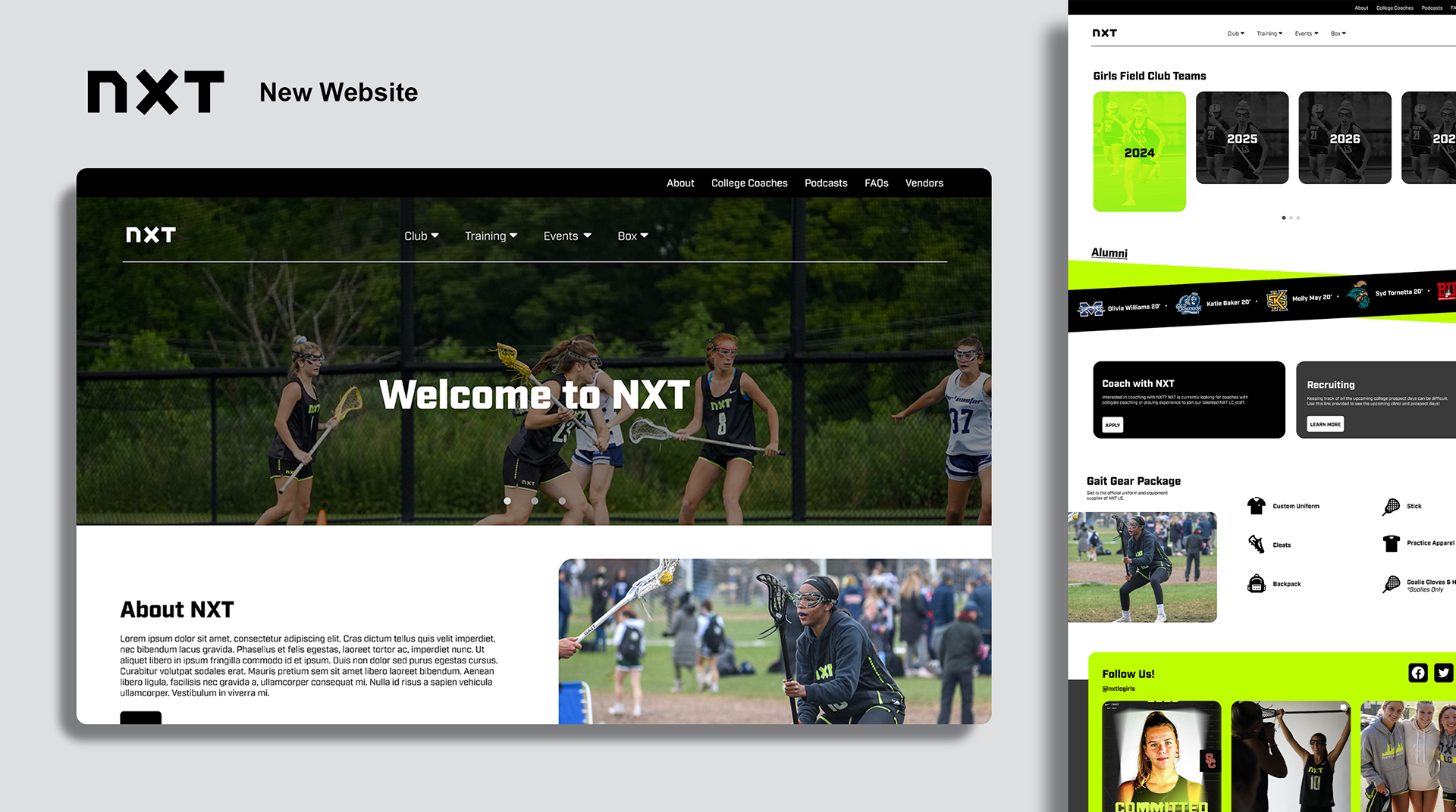
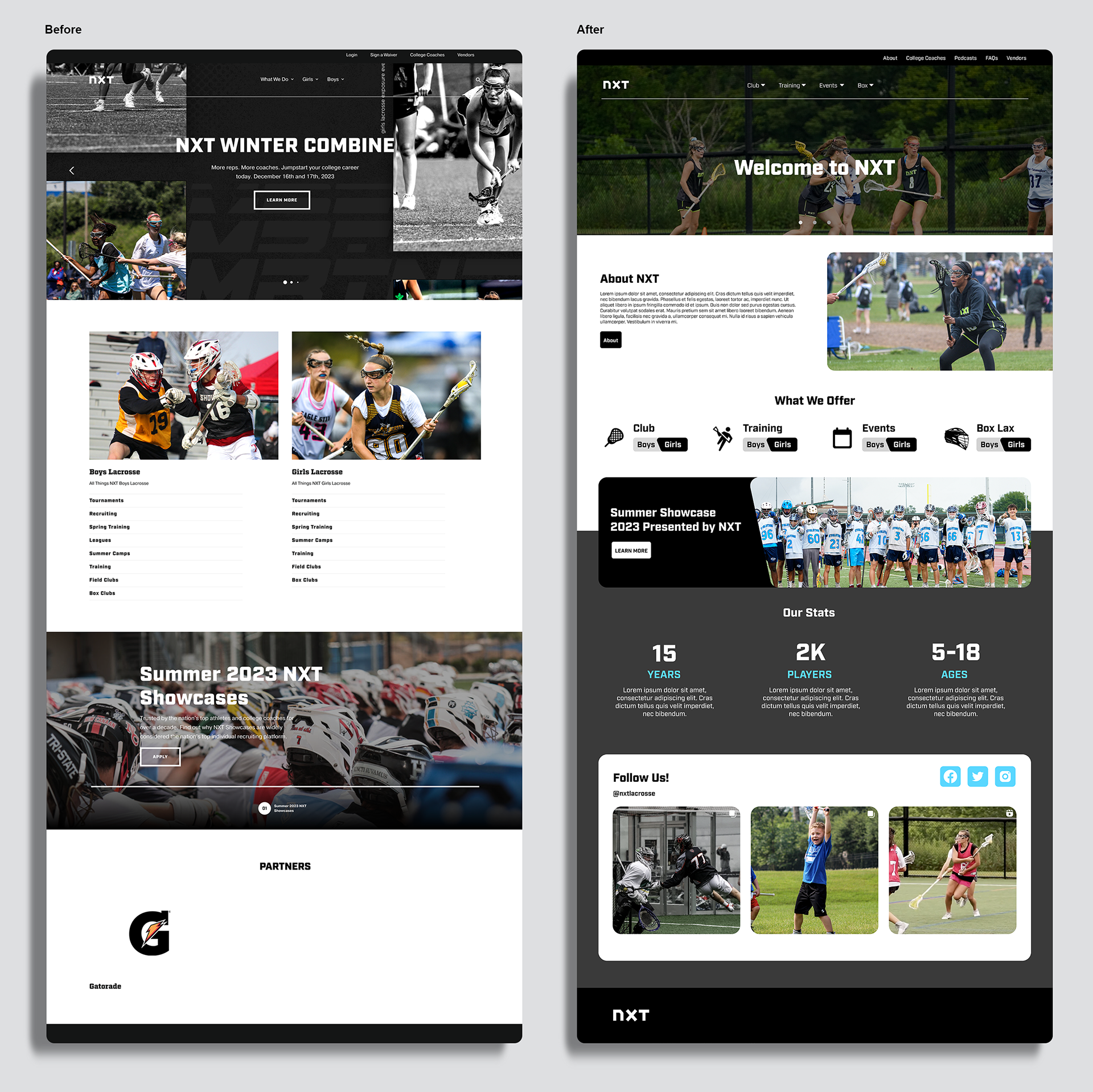
NXT came to us with a list of issues they wanted solved. Top of that list was how many people were confused with the navigation. So our focus during this whole project was to organize, simplify, and reduce. We reduced the overall amount of pages on the site, we organized the navigation and simplified most pages for ease of use.
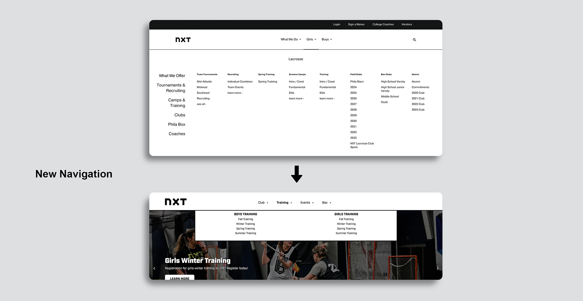
Navigation Challenges
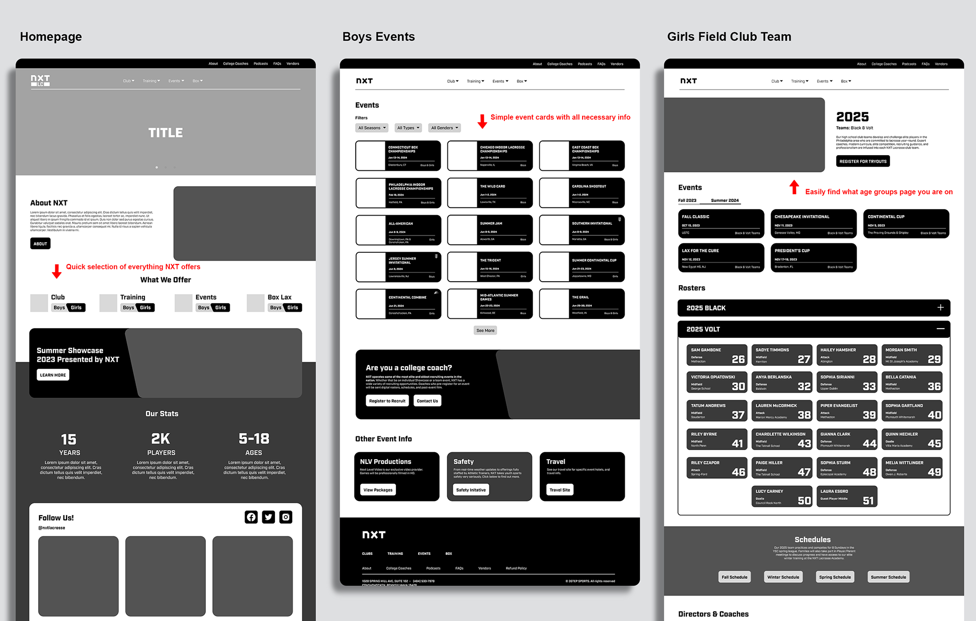
Since the original navigation was overcomplicated and had a lot of extra buttons, we first had to organize all of these buttons into buckets. We settled with Club, Training, Events and Box. Working with NXT's stakeholders we eliminated many extra pages and buttons and fit everything into one of these 4 buckets.
Overall Solution
Leveraging my skills, I initiated the creation of a clean design, responsive pages, and standardized event formats for tournaments, creating a consistent visual style. I developed wireframes for landing pages, events, alumni, tournaments, and more, ensuring a cohesive design throughout.
Process
We have a specific process for our web redesign projects, so the following steps are standard across every website we touch as a team. I am involved heavily on the beginning of the project to setup the framework and design for the rest of the project.
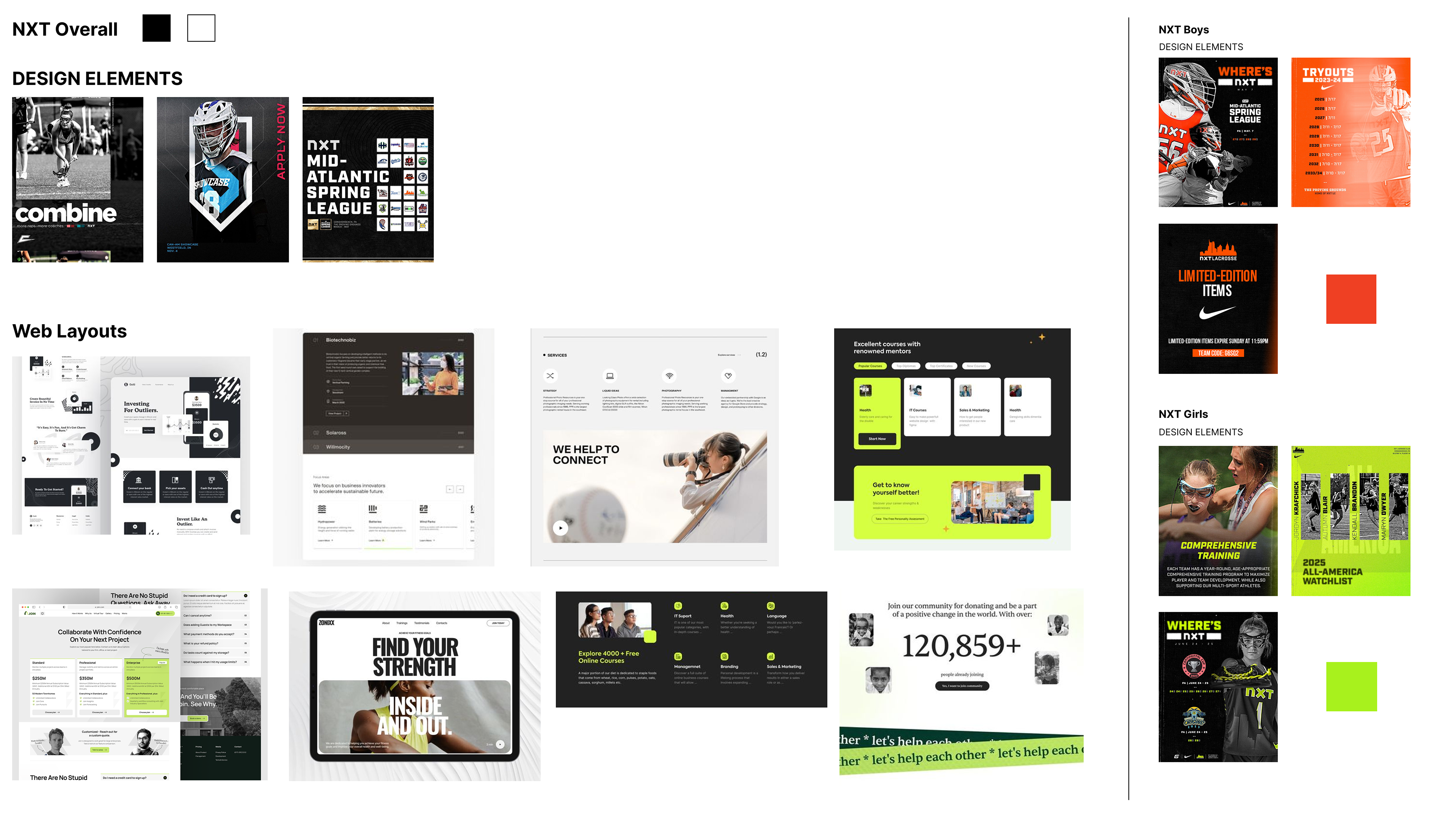
Discovery, Moodboarding & Stakeholder Interviews
We start off with discovery and moodboarding, which allow us to research competitors, common layouts, and possible designs.
After, we move into the stakeholder interviews where we show the main contacts of the brand the sitemap, and moodboard. We make sure everyone is on the same page. Any questions about design, layout, and navigation are addressed during this meeting.
Low Fidelity Wireframes
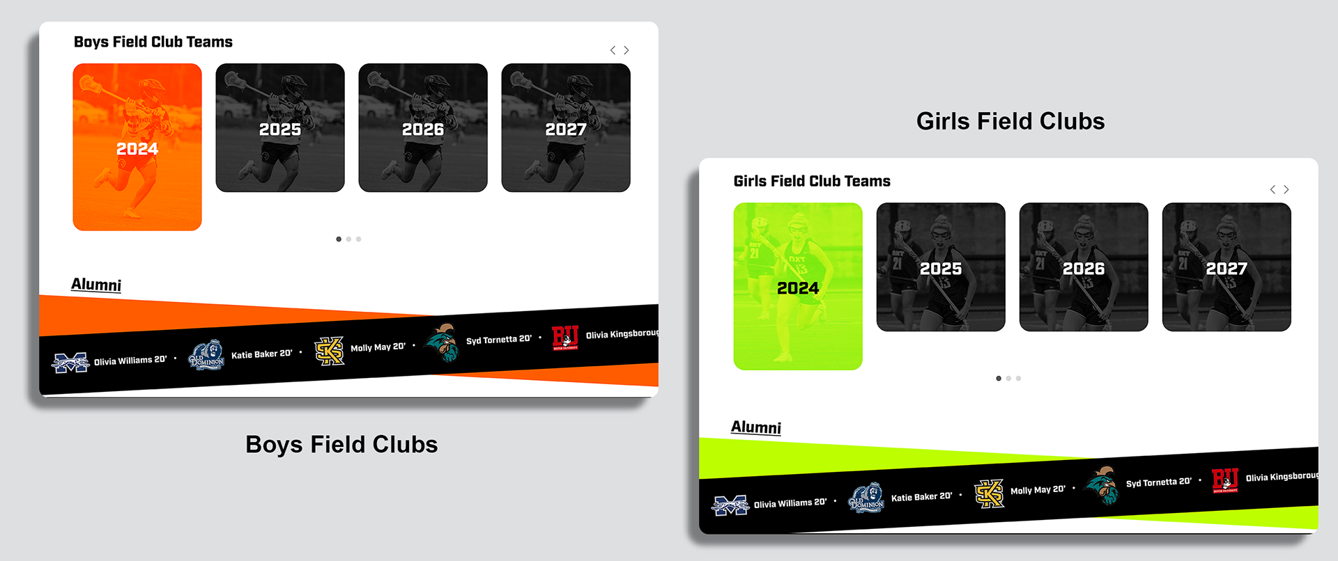
I then put together wireframe options. I focused on simplicity, opting to focus on card elements since thats what we decided the overall design would follow as well. As mentioned above, the overall goal is to simplify, most of my time during this project was simplifying information and laying it out in the most common sense way possible.
For example, having the rosters in close able cards so that the page isn't just filled with a whole team of names. Or having the event info grouped together for easy scan ability.
Visual Design
After stakeholder reviews, I created high-fidelity designs and worked on branding elements based on the final version of the wireframe.
I began with visual branding for all the screens. I used consistent font, type, size, and color. I also incorporated balance, proximity, alignment, hierarchy, repetition, and contrast.
I got feedback on my designs and ideated, then used Figma's auto layout and created a component library for all components.

Development
At this step, I hand off the finished high fidelity wireframes to the dev and assist when needed to create assets, and answer layout questions. Once the dev is complete we review the design a final time with the stakeholders and make changes if needed.
Results
With our teams efforts, NXT got a brand new website that is easy to navigate and is straight to the point on each page. This revamped experience resulted in higher engagement levels and more registrations. It's also much easier for NXT to edit, they don't need to edit 4 pages if they change one item.
My Impact
This case study shows my ability to lead the UX portion of the project by showcasing content-focused transformations, while creating high fidelity designs during the UI phase. I was able to showcase my skills in content design, user experience, and collaboration with the other members of my team throughout the process.
NXT also has received many more web visits since the redesign. My thoughtful ideas of how to layout the pages in a common sense way helped create more community-engagement.
